
That more or less sums it up.
Isn’t this map beautiful though? I love the gentle dip and curve of the river, coursing through the grid of streets.
 The same area is mapped in below, in a 1906 map from The New Encyclopedic Atlas and Gazetteer of the World.
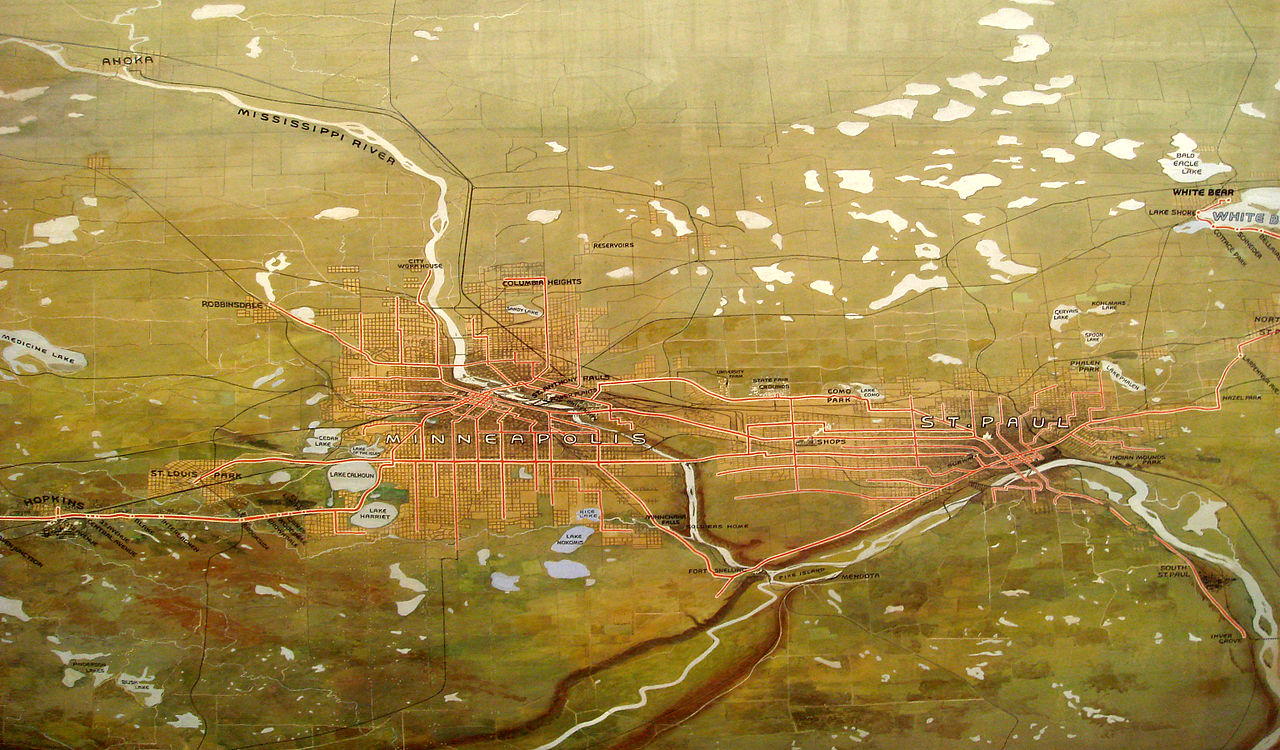
 And again in this beautiful commissioned watercolor map done by John Jager for the Twin Cities Rapid Transit Company in 1904.
 Finally, this map shows the area from quite a different angle. The image is from a flyby, a visual representation “as seen by the Landsat Thematic Mapper (TM) instrument. The shortwave infrared (TM band 5), infrared (TM band 4), and visible green (TM band 2) channels are displayed in the images as red, green, and blue respectively. In this combination, barren and/or recently cultivated land appears red to pink, vegetation appears green, water is dark blue, and artificial structures of concrete and asphalt appear dark grey or black.”
 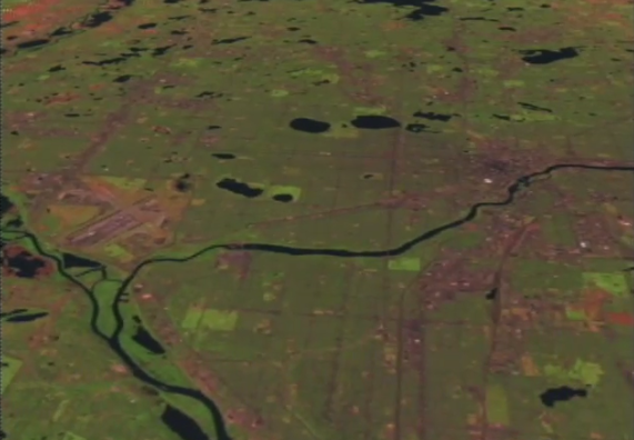 There is the video from which this is taken. It’s fascinating. Thanks NASA, you’re rad.
